Forum Replies Created
-
AuthorPosts
-
 rrawerParticipant
I’m having a similar issue on my Samsung Galaxy device and agree the restart button would be very helfull !
rrawerParticipantHave you tried an update to the current version? In my installation there is a reset button instead of the distance value…
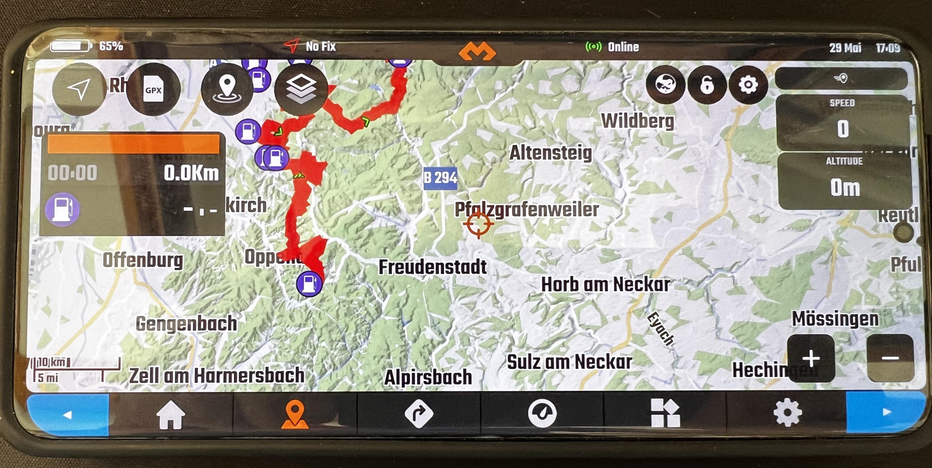
rrawerParticipantI tried the long-press of the top button again – it does not disable Panmode but only highlights both arrows in the bottom menu blue (see image) and the only way to get rid of teh color marking was to switch on and off the lock in Map Mode…
-
This reply was modified 11 months ago by
 rrawer.
rrawerParticipantIt is not running on battery, it is using the SP connect Wireless Charger – it’s hard to get some data about it but it seems that it is only loading with 7.5W max (the standard goes up to 15W though) – so maybe in total in sunlight it’s just above that limit in total power consumption and therefore it is actually draining additional battery power – or maybe it is in combination with the incorrect battery charging indicator? (however I tested on another wireless charger at home and it actually did charge the battery wireless when DMD was running – have to try it again using the SP Connect charger on the bike to be sure tough…)
rrawerParticipantThat is certainly correct, however, that mode puts a very strong emphasis on non-sealed tracks. For on-road navigation this is even more confusing (keep in mind, here in southern Germany most non-sealed roads are prohibited to be used by ordinary vehicles, so unfortunately you can’t use them for navigation…) so a third mode woudl help (I’d personally would not keep the currnet “low-contrast” view at all, because in an urban region you can hardly identify any of the smaller roads once you’re riding the bike because of the lack of contrast)
rrawerParticipantwas not aware of that function, you are correct that’s quite close.
Two points though:
1) Could you stick to the last setting of the view once you close it (e.g. if you are using the half-screen mode, next time you open POI it uses half-screen mode gain – currently it always uses full-screen mode)
2) in half-screen mode: the map automatically puts the selected POI in the center of the total screen but, rather than the portion of the map visible (which is not covered by the remaining POI dialog) – which has no real benefit, because, once you close the POI dialog the map is back to it’s original position anyway…
3) marking the active POI in another color but green would help to find it much faster on the map – the green flag has a very low contrast – bright red for example with a white or black border would stick-out much better – Right now you basically need to know what you are looking for to identify the POI, rather having a high-contrast symbol you’d immediately know: that’s what I am looking for…-
This reply was modified 11 months, 1 week ago by rrawer.
rrawerParticipantI had another look into the POI search preview maps.
Currently when you select a POI of the list on the left on the POI Search dialog The search dialog gest 50% transparent, you can see the semi-transparent map and its moves to the POI in a certain Zoom setting until the POI marked with a green dot is in the center, then the map disappears. If you select the next POI it moves from the last POI to the new POI and disappears again – this means you get a rough ide of where are the two POIs in relation to each other.
The feature itself (seeing the POI on the map) I find extremely helpful, however there is the topic I started the discussion about: The map disappears before you had the time to grasp the information, and you basically have to jump between close POIs several times to get the information – so in any case they need so stay there longer and the map should be more dominant (maybe by setting the POI search Screen to 80% transparency instead of 50%, and keep it active for another 3 seconds or so?)
For some of the POI categories this might be the information you would like to have (is the camping spot close to the ocean, is the hotel in the city center – in this case you want to see the surrounding of that spot as it is right now.
However, another important use-case is taking detours from you current track for a gas station, a lunch break. In this case the current solution does not give me beneficial information. Instead I would need the information on the map: Where am I now, What is m y Track and where is the POI in relation to both. So the map should auto-zoom to cover my current position and the POI and it should plot my current route. And by going through the list I can make the decision of relevance: Do I make a detour to the closes gas station or is there time to wait another 10k’s to reach the one which is directly on my route/track.
While this two modifications would probably need less coding, the way the UI is designed always means the map needs to disappear to be able to access the POI list. Which always results in switching between POIs in order so see the map for a longer time which I find sub-optimal for the given task.
Maybe it would be possible to display a second map in the right half of the POI search dialog alternatively to the currently displayed buttons. This map would then permanently display the selected POI (and current location and route). You should be able to zoom and move the canter of the map, and for usability allowing more than 50% of the width (maybe 65 as a trade-off between list-width and map size) fior the map would help.rrawerParticipantI had another test-drive and you are right, the auto recalculation of the route is good, I prefer it to many other devices because it seems not to start with trying to redirect you back on the original route but right away finds a new route (at least that was my impression during testing).
Nevertheless, since you need a certain distance to trigger this auto recalculation there are certain situations especially in navigation in cities, where I still would prefer to have the additional option to manually trigger the recalculation (you could add an additional button in the menu of the options button of the navigation info-section on the left)
Example: A city with lots of long one-way streets, you did a wrong turn and are now at the next red light and need to make the decision how to get back to the track but the direct way is a one-way street in the wrong direction – you’d really appreciate the button to start the recalculation of the route from the current redlight (still red) rather than go straight froward over a bridge and ending up on the wrong side of the river on another one-way street where there is finally enough distance to trigger the auto-recalculation. Situations like this actually happen quiet often, and usually (also using TomTom or all the others) I stop by the road, end navigation and restart navigation to the last destination – so I really miss that button in all the navigation systems/apps I’ve been using so far.By the Way:
A List of recent destinations as well as preferred destination (like home, and other favorite spots) would be nice to haverrawerParticipantOK,
Maybe I was just not patient enought – I’ll test it again…rrawerParticipantSorry – Maybe I’m just to stupid to use the function correctly :-))
So, I go to the maps view and select the POI Gas Stations. So I get the list with the gas stations according to distance (certainly very useful!). So I select one and I get the preview of the location on the map in a semi-transparent map view – however, this preview (transparent map view) only stays there for a few seconds then it disappears again (list view without the preview map) – its simply to fast to find your way in this preview. Maybe this is a bug on my Samsung device?
So there are two points:
1) when the map would be more dominant in this view it would be much easier to read
2) it would help if the preview map would not automatically disappear after a few seconds but if you could either have a close button for the preview or it simply stays active until you select the next POI in the list or close the POI list…
In addition: Now since it is only displayed for a few seconds so far it is really hard to gasp where the gas station is located on the map (find the green flag) and where that is in relation to my current position and maybe in how much distance to the currently active track.
If the preview however would stay longer, for the example of the gas stations I would like to compare the different positions of the Gas stations and find the one with the least detour – and decide weather I’d rather make a detour to reach one of the closest one (maybe also my favorite brand) and maybe a more distant one which is directly on my track.For this I would like to see the current track, my current position and the POI (all three of them are displayed already I think but am not sure because the maps don’t stay long enough). If you auto-adjust the zoom according to the selected POI it becomes hard to grasp the distance between the different POIs, so it would be faster if the zoom level could be fixed manually and for example you select a distant one and when you select the close ones the zoom level does not change and hence you see the same map image and only the position of the green flag (POI of the gas station) change – so much easier to find the POI you like best…
But 1) and 2) would be the most important changes…
hope that makes it clearer, otherwise I do some screenshots tonight…
-
This reply was modified 11 months ago by
-
AuthorPosts